Interactive cards
2025
Integrating storytelling and entertainment into a single, scalable component
Role: Senior Manager, User Experience and Design
Contribution: Strategic direction, cross‑functional alignment, design systems governance, experience quality, and team development
Team: Giancarlo Cianelli, Bryan Levy
Leading a unified component strategy across teams
I led the vision, strategy, and cross‑functional alignment for a new interactive card component that needed to serve two very different product teams — Starlink and Hemispheres — each with unique goals, content models, and brand expressions. My role was to guide the team through ambiguity, establish a shared foundation, and ensure we delivered a flexible, scalable solution without sacrificing usability or craft.
Two distinct needs, one shared opportunity
Through early discovery and alignment sessions I facilitated, we identified a convergence point:
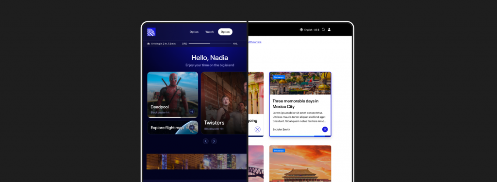
Media-centric IFE Dashboard
- Needed a media‑centric card that could showcase travel info, entertainment options, and rich media.
- Required performance in dense layouts and support for varied metadata.


Editorial Experience
- Needed a compelling entry point into destination articles.
- Required strong storytelling, imagery, categorization, and delight.
I guided both teams toward a shared component strategy that could flex to their needs while reducing long‑term design and engineering overhead.
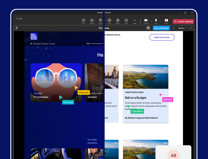
Co-creating with stakeholders
I structured and led collaborative working sessions with both working groups to surface constraints early and build trust across teams.
Starlink team
We clarified requirements around rich media, metadata, and layout density. I helped the team prioritize flexibility without compromising performance.
Hemispheres team
We aligned on storytelling needs, editorial hierarchy, and interaction patterns. I ensured the component could support both functional and emotional engagement.
Balancing flexibility, simplicity, and brand expression
Before any design work began, I guided the team through a structured evaluation of the constraints:
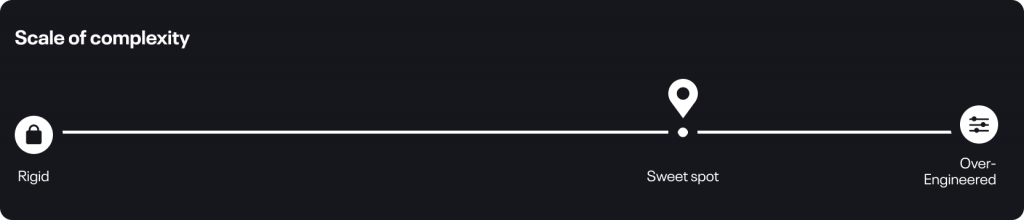
Flexibility vs. simplicity
The component needed to support a wide range of content types without becoming bloated. I set the principle that flexibility should never come at the cost of clarity or maintainability.
Sub-brand adaptability
I ensured the component could adapt to distinct visual styles — from Hemispheres’ editorial layouts to Blackbird’s cinematic UI — while maintaining consistency at the system level.
Usability and accessibility
I established guardrails to ensure the component remained intuitive, accessible, and predictable across all contexts.
The solution: A scalable, governed component
Under my direction, the team delivered a component with 8 customizable properties that balanced flexibility with simplicity. This structure anticipated future use cases without introducing unnecessary complexity — a key leadership goal I set from the start.
Customizable properties:
Size, style, theme, enhancers, badge, pre-title, avatar and byline
Outcomes & impact
Meaningful impact across channels
- Increased click‑through rates across Hemispheres entry points by giving users a clearer, more compelling point of engagement.
- Elevated NPS in the Starlink onboard experience by unifying storytelling, media, and interaction patterns.
- Reduced design & engineering overhead by consolidating multiple bespoke cards into one flexible, governed pattern.
Organizational impact
- Established a shared component strategy that scaled cleanly across teams.
- Strengthened cross‑functional alignment and reduced fragmentation.
- Set a precedent for designing components with global, omni‑channel use in mind.
What I learned
- Designing from a global, omni‑channel perspective prevents fragmentation and accelerates adoption.
- Early co‑creation with stakeholders surfaces constraints sooner and builds shared ownership.
- A well‑governed component can drive brand cohesion, interaction consistency, and measurable business outcomes — without limiting creativity.
- Leading through ambiguity requires clarity, structure, and a strong point of view on quality and scalability.